Study suggests 'hard to read' fonts may increase reading retention
June 1, 2011 by Bob Yirka in Psychology & Psychiatry
(Medical Xpress) -- Researchers from Indiana University and Princeton, in a paper published in Cognition, describe two experiments they conducted that appear to show reading retention improves when fonts that are considered harder to read are used.
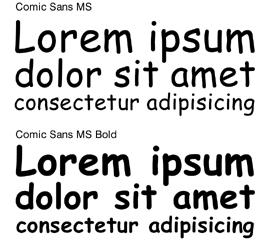
In the study, as described by lead author, Connor Diemand-Yauman in an interview with ABC Radio National, a first group of volunteers, comprised of 28 adults, were asked to read some fictional text and then were asked questions about the characters involved afterwards. The volunteers were divided into three groups, with each being given the same text but printed in a different font; the first got 16-point Arial, the second 12-point Comic Sans MS and the third 12-point Bodoni MT. The group that had the so-called hard to read Comic Sans outperformed the other two on the questions given afterwards.
In the second study, the volunteers were high school students (over 220 of them, from six separate groups) reading normal course material in different fonts; some of which were considered hard to read, such as Comic Sans or Monotype Corsiva. Once again, those that were reading the material printed in the more difficult to read fonts outperformed those reading easier type on tests given afterwards.
Diemand-Yauman says these experiments show that people tend to remember what theyve read better if the material given is in a hard to read font.
Whats not discussed in the paper, however, is if it was possible that the results achieved were due simply to the newness of the fonts to the readers, thus heightening their awareness, or what criteria was chosen in deciding which fonts should be considered as hard to read. Many fans of Comic Sans, for example might argue that its actually easier to read than say Arial, or Callibri, both of which are considered easy to read by most in the mainstream.
Also, if what the study suggests is true, might it be possible to integrate such fonts as Comic Sans into textbooks, or journals (or on the web) to help improve retention, and hopefully overall learning, or would such hard to read fonts cause excessive eyestrain and headaches?
In either case, its clear that this research has opened the door to a new area of learning science that will no-doubt lead to more studies which will hopefully clear up such questions and in the end provide us all with the best font for whatever we might be reading.
More information: Fortune favors the bold (and the Italicized): Effects of disfluency on educational outcomes, Cognition, doi:10.1016/j.cognition.2010.09.012
Abstract
Previous research has shown that disfluency the subjective experience of difficulty associated with cognitive operations leads to deeper processing. Two studies explore the extent to which this deeper processing engendered by disfluency interventions can lead to improved memory performance. Study 1 found that information in hard-to-read fonts was better remembered than easier to read information in a controlled laboratory setting. Study 2 extended this finding to high school classrooms. The results suggest that superficial changes to learning materials could yield significant improvements in educational outcomes.
© 2010 PhysOrg.com
-
Making ideas harder to read may make them easier to retain
Oct 29, 2010 |
not rated yet |
0
-
University of Pennsylvania's PR2 robot learns to read (w/ video)
May 20, 2011 |
not rated yet |
0
-
Study shows difficult to read instructions decrease motivation
Oct 30, 2008 |
not rated yet |
0
-
No Speeding Reading with eBooks?
Jul 07, 2010 |
not rated yet |
0
-
Asus Eee reader: The world's first 9-inch touch-screen ebook reader
Dec 01, 2010 |
not rated yet |
0
-
Limits to growth: Scientists identify key metastasis-enabling enzyme
May 22, 2012 |
5 / 5 (3) |
0
-
Seeing is as seeing does: Spatially-structured retinal input in early development of cortical maps
Apr 26, 2012 |
5 / 5 (4) |
1
-
Dreamless nights: Brain activity during nonrapid eye movement sleep
Apr 09, 2012 |
4.4 / 5 (12) |
0
-
Take your time: Neurobiology sheds light on the superiority of spaced vs. massed learning
Mar 28, 2012 |
4.5 / 5 (21) |
3
-
Your brain on 'shrooms: fMRI elucidates neural correlates of psilocybin psychedelic state
Feb 29, 2012 |
4.9 / 5 (42) |
45
-
A question about drug tolerance
May 23, 2012
-
Poor nutrition leading to overeating?
May 23, 2012
-
Math and dyslexia?
May 21, 2012
-
portable metabolism meter?
May 21, 2012
-
Rare medical conditions on 20/20 tonight
May 18, 2012
-
"Good" Cholesterol in Doubt
May 17, 2012
- More from Physics Forums - Medical Sciences
More news stories
Feeling strong emotions makes peoples' brains 'tick together'
Experiencing strong emotions synchronises brain activity across individuals, research team at Aalto University and Turku PET Centre in Finland has revealed.
Psychology & Psychiatry
8 hours ago |
not rated yet |
0
Formal recognition of PMDD will lift stigma for women
A decision to recognise premenstrual dysphoric disorder as a genuine psychiatric condition will finally provide validation for this awful and poorly understood syndrome and alleviate the stigma ...
Psychology & Psychiatry
10 hours ago |
2 / 5 (1) |
0
Long-term meditation leads to different brain organization
(Medical Xpress) -- People who practice mindfulness meditation learn to accept their feelings, emotions, and states of mind without judging or resisting them. They simply live in the moment.
Psychology & Psychiatry
10 hours ago |
5 / 5 (1) |
0
|
Older African-Americans use religious songs to cope with stress, study shows
(Medical Xpress) -- New research from the University of North Carolina Chapel Hill School of Nursing has shown that older African-Americans use religious songs in a personal way to cope with stressful life events. Songs long ...
Psychology & Psychiatry
11 hours ago |
not rated yet |
0
Spatial configuration can spark deja vu, psychology study reveals
(Medical Xpress) -- Déjà vu - that strange feeling of having experienced something before - is more likely to occur when a scene's spatial layout resembles one in memory, according to groundbreaking new research ...
Psychology & Psychiatry
12 hours ago |
not rated yet |
0
|
Study provides compelling evidence for an effective new treatment for tinnitus
According to new research, a multidisciplinary approach to treating tinnitus that combines cognitive behaviour therapy with sound-based tinnitus retraining therapy is significantly more effective than currently available ...
Autism often not diagnosed until age 5 or older: U.S. report
(HealthDay) -- Even though autism symptoms typically emerge before age 3, most children with autism are diagnosed when they're 5 or older, a new snapshot of autism in America shows.
'Personality genes' may help account for longevity
"It's in their genes" is a common refrain from scientists when asked about factors that allow centenarians to reach age 100 and beyond. Up until now, research has focused on genetic variations that offer a physiological advantage ...
Amino acid consumption associated with how fast cancer cells divide
For almost a century, researchers have known that cancer cells have peculiar appetites, devouring glucose in ways that normal cells do not. But glucose uptake may tell only part of cancer's metabolic story. Researchers from ...
Gene discovery points towards non-hormonal male contraceptive
A new type of male contraceptive could be created thanks to the discovery of a key gene essential for sperm development.
Brentuximab vedotin effective in large-cell lymphoma
(HealthDay) -- More than half of patients with relapsed or refractory systemic anaplastic large-cell lymphoma (ALCL) treated with the CD30-directed antibody-drug conjugate brentuximab vedotin achieve a complete ...
Jun 01, 2011
Rank: 5 / 5 (1)
Jun 01, 2011
Rank: 5 / 5 (1)
But what the study forgot to verify, is if people, in their normal lifes, would try so hard to read texts with difficult to read fonts!
When confronted with some texts in REALLY hard fonts, like Gothic fonts and some others, where its hard to even identify caracthers, I usually give up on reading them.
I suppose however that a medieval monk would have an easier time reading a text in gothic font than in Comic Sans or Arial.
Jun 02, 2011
Rank: not rated yet
Trantor is on the money in my opinion.