And how do you read your typeface? Credit: Justmakeit, CC BY-NC
When we want what we write to be clearly communicated to a reader, we generally try to use a typeface that is clear to read. But few people realise how quickly your choice of typeface affects that process. If we can understand it better, we can design typefaces more effectively.
Readers like expending as little effort as possible when identifying individual letters and recognising words, so that they are left with more capacity to focus on understanding the meaning of the text.
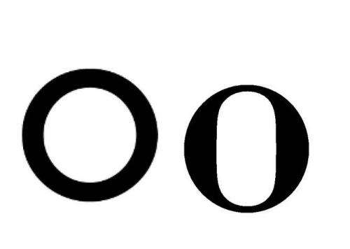
Today we have many legible typefaces, each of which has its own visual style. Futura, for example, has no contrast of thick and thin strokes whereas Bodoni has substantial contrast. Other characteristics include the slant, the weight and the angle of stress.
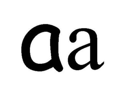
Despite this variation, fluent readers can, apparently without undue effort, identify quite different shapes as all being the same letter. An 'a' in Comic Sans looks very different from an 'a' in Times New Roman but they are still instantly understood as an 'a' to the reader.
It can be relatively difficult to differentiate between some fairly similar letterforms, though. On the face of things, a 'c' and an 'e' have very similar shapes, as do an 'i' and an 'l'. A comparable problem occurs in speech perception, where we need to identify vowels from different speakers. This is a challenge because the acoustic pattern of a vowel from one speaker is distinct from their other vowels but overlaps with the acoustic pattern of a different vowel spoken by someone else.
In designing typefaces, there is a tension between making sure there is a uniformity of style, which is achieved through commonalities in the shape, proportions, and other attributes of letters within a typeface and ensuring that each letter is distinct. For typographer Jan Tschichold, "legibility has its roots simply in the comfortable recognisability of thoroughly distinctive yet congruent letter forms".
How contrast can vary
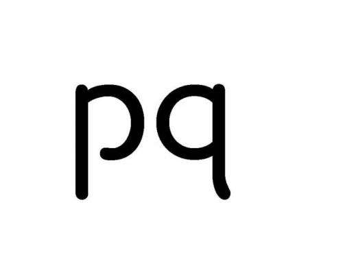
There are even typefaces designed specifically for dyslexic readers. Among otherthings, these tend to aim at increasing the distinctions between confusable letters. Dyslexic readers, it seems, prefer "p" and "q" to have distinct shapes rather than just be mirror images of each other, for example in the typeface Lexia Readable.
Challenges of identifying letters
At the same time, there is psychological evidence that the shared traits between letters can help a reader identify them more efficiently. This has been explained as the reader's perceptual processing system tuning to the regularities across letters.
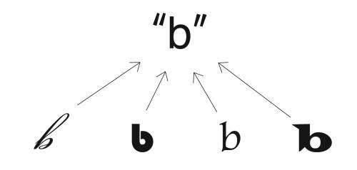
Type designers add stylistic features to the basic forms of letters, whereas the reader considers the letter the other way round. They identify which stylistic forms have been added and remove them to find the basic form beneath it.
So many Bs.
This process happens within a fraction of a second, when our eyes first fix on letters. If we focus on this process, we might be able to better understand how we process typefaces.
By collaborating with typeface designer Sofie Beier, we've identified some of the outstanding questions that need to be answered.
We don't yet know exactly when we retune so we don't know how the level of distinctiveness between typefaces affects timing. We don't know if retuning is a default process and we don't know if it happens gradually or rapidly. Nor do we know exactly what triggers it – is it that we have noticed that the letters are in a different typeface or that we struggle to identify certain letters? We don't know if it happens more in some readers or reading contexts than others.
Irregularities of style
These are all important questions that could help us design better typefaces. We might even try to see if some irregularities, such as one or two particularly quirky letters in a typeface prevent us from tuning, making reading it more difficult.
This last question links to the contradictory objectives of distinctive yet congruent forms. If we know the answers, we could make better decisions about the optimum degrees of uniformity and distinctiveness in our typeface and about whether uniformity across some features, such as width, placement of serifs are more important than others.
Once these issues have been addressed, we could have a firmer basis for supporting people who have more difficulty reading – but we could also choose typefaces for specific purposes and design new typefaces that optimise legibility.
We may never be able to resolve the difficulties we have understanding the nuances of speech because we can't choose what people's voices or accents sound like but we do have control over what we read and how we present words to each other. With a little more understanding, we could develop typefaces that are not only visually pleasing but also highly functional.
Provided by The Conversation
This story is published courtesy of The Conversation (under Creative Commons-Attribution/No derivatives).
![]()


