Credit: Regenstrief Institute
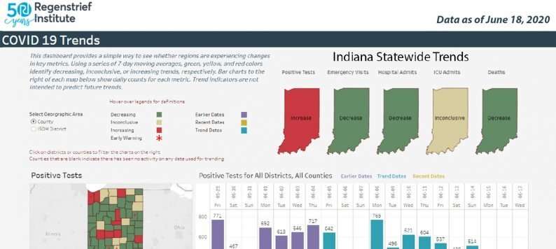
Trends are a vital component of tracking and understanding the COVID-19 outbreak. The COVID-19 dashboard on the Regenstrief Institute website now shows data trends from across Indiana in an easy-to-understand, interactive display. The dashboard, created by Regenstrief and its data partners, helps to inform Indiana public health leaders and the general public with necessary information during the pandemic.
Within the trending section of the dashboard, color codes help model the data. Information covers positive disease tests, emergency department visits, hospital admissions, intensive care unit admissions and deaths. The dashboard displays trends by sex, age, race, and comorbidity.
In addition, Regenstrief has added an early warning indicator, which highlights locations where the numbers in the last three days are higher than the previous seven days, which could identify an increasing trend. Data for this purpose can be viewed at a state, Indiana State Department of Health preparedness district, or county level.
"This new capability is an excellent tool for visualizing key indicators, helping to spot areas of potential concern as well as the areas of improvement we are all hoping for," said Regenstrief President and Chief Executive Officer Peter Embí, M.D., M.S, one of the project leaders. "Data is a powerful tool in healthcare and that has never been more apparent than in the present circumstances. Regenstrief is proud to be part of the effort to make this data rapidly and accurately available to both public leaders and Hoosier citizens in an easy-to-understand format to help provide insight into the unprecedented situation we are all experiencing."
The information contained in the Regenstrief dashboard is complementary to information provided by the Indiana State Department of Health. The hospitalization data, contained in the Regenstrief dashboard, informs one of the four principles Indiana leaders are using to guide their reopening strategy.
Provided by Regenstrief Institute


