Yarraman flu or horse flu? Words and graphics influence willingness to vaccinate

"Yarraman flu is a virus quickly infecting the U.S. ...." The mock announcement was enough to make readers worry. But when the name of the hypothetical illness was changed to "horse flu", the news elicited a different reaction. Readers were not as concerned, and reported being less motivated to get a vaccine that would prevent them from contracting the illness.
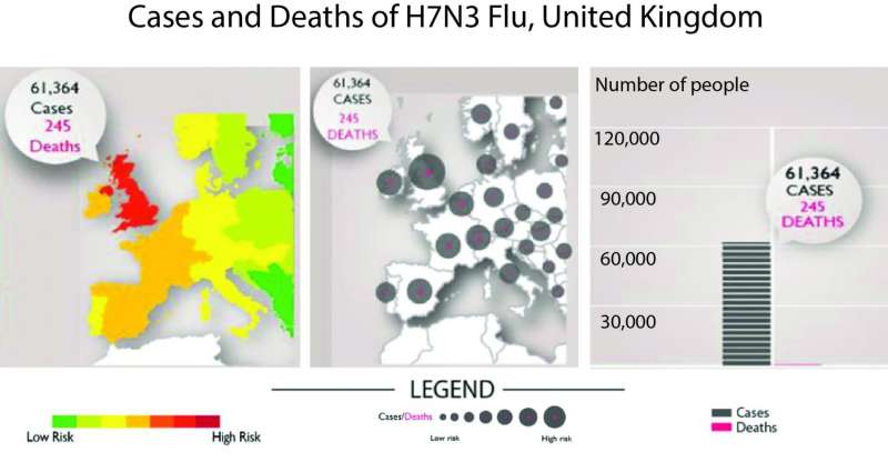
Graphics, too, altered perceptions of risk. Even though each of three graphics presented the same information, colorful heat maps in which the point of outbreak blazed red consistently triggered stronger reactions than dot maps that punctuate geographical distribution of the influenza, and bar-type graphs.
Based on a survey of 16,510 participants from 11 countries, the findings show that the way health information is communicated, matters. A research collaboration between scientists at U of U Health University of Michigan, University of Iowa, and Radboud University in the Netherlands, was published as two studies: one recently in Vaccine and the second in Emerging Infectious Diseases on June 21.
"Our results highlight that choices for public communications about health issues cannot be made simply by convenience or without consideration," says Angie Fagerlin, Ph.D., chair of population health sciences at U of U Health. "If we can present information in ways that increase the public's understanding, it's a win for everybody."
Additional studies are needed to examine whether messaging can go beyond changing readers' intent to actually altering behavior, driving more people to get vaccinated during critical times.
Leading health and news organizations regularly publish reports on public health issues, including infectious disease outbreaks, bringing information to millions of people. Yet little research has been done to gauge how subtle differences in the ways in which the information is presented shapes public perception.
To investigate, the research team distributed an opt-in online survey within nine European countries, the U.K., and the U.S. Participants read a mock news article written in their primary language that described the spread of a pandemic flu within their country. They then completed a survey measuring their attitudes toward vaccination, knowledge about information in the article, and concern for contracting the flu.
Participants read the mock story with one of three random flu names and graphic visualizations. Inspired by actual disease names (ie. Spanish flu, H1N1 influenza, bird flu), the imaginary illnesses included the exotic sounding "Yarraman flu" (Yarraman is an Aboriginal word for "horse"), the scientific "H11N3 influenza", and "horse flu", named for the animal that transmits the virus. Alternatively, the article included one of three types of graphics, each showing a rise in the prevalence of influenza, and number of related deaths, over three months.
Participants who read about "horse flu" were significantly less motivated to get vaccinated compared to those who read about "Yarraman flu" or "H11N3 influenza". That same trend echoed across each of the 11 countries surveyed. Out of a 7-point scale, with the highest number meaning "definitely would get a vaccination" and the lowest indicating "definitely would not get a vaccination", the sentiment dropped from 4.66 to 4.54 (p = 0.002).
"In public health, relatively small effects can have relatively large impacts on a population level," explains first author of the flu label study, Aaron Scherer, Ph.D., from the University of Iowa.
For visuals, readers indicated they preferred heat maps, and those who used them to interpret the hypothetical outbreak said they were more likely to vaccinate than those who saw bar-type graphs (4.67 vs. 4.56, p = 0.01). Heat map viewers also thought they were more likely to get the flu, had a better grasp of the facts about the outbreak, and a greater interest in learning more.
More than that, the findings suggest that some tactics work better than others to inform health decisions. "It is incredibly important that we communicate effectively, as it has the potential to improve public health," says co-author and pulmonologist Thomas Valley, M.D., M.Sc. from the University of Michigan.
More information: "Communicating infectious disease prevalence through graphics: results from an international survey" was published in Vaccine.
"Effect of Influenza Label on Worry and Behavioral Intentions: A Multi-Country Web-Based Experiment" was published in Emerging Infectious Diseases.


