Maps, pandemics and reckoning with history
As cholera claimed hundreds of thousands of lives during the 1846–1860 pandemic, John Snow was the first person to figure out how the deadly disease was spreading. By plotting the locations of deaths in London's Broad Street, Snow discovered a link between cholera cases and contaminated water sources, and his now famous yet simple dot map is considered by many to be the start of the field of epidemiology.
With COVID-19 dashboards a regular feature of news reports and mitigation strategies, the coronavirus pandemic is a living example of the significance of maps and geospatial data. As the country grapples with coronavirus while also reckoning with its history of inequality and systemic racism, can maps be more than tools for tracking coronavirus cases? Could maps also help societies chart a path towards a better future?
Mapmaking fundamentals
More than 170 years after Snow's famous cholera study, Mapping & Geospatial Data Librarian Girmaye Misgna says that maps have become even more powerful thanks to advances in data science and geographic information systems (GIS). "When it comes to COVID, the map has become a very important part of numerous activities: Capacity and resource management as well as tracking the movement of the virus and where it's concentrated," he says.
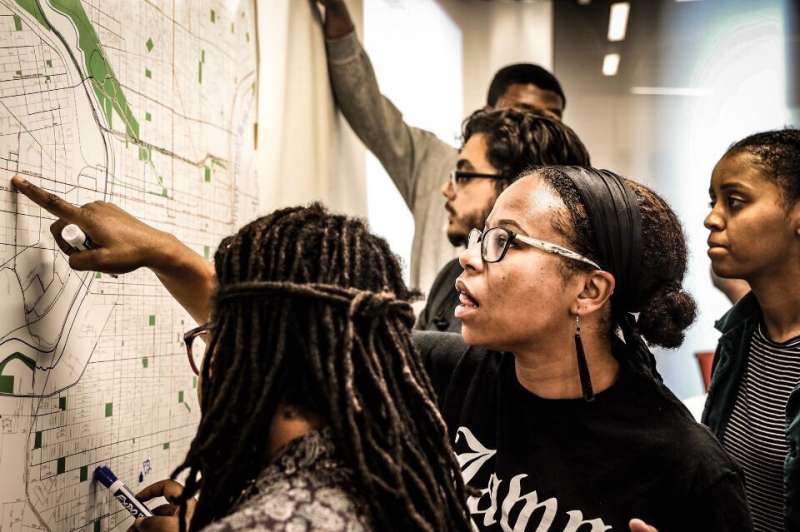
Misgna and his team support research and scholarly activities at Penn that incorporate maps and spatial data, and often his team's first step is to help the students, faculty, and staff they work with to understand the process of creating a map, not just to focus on what the map will look like. "The main problem with GIS is, first, where to find the data, in what form, and how do you manage it in a way that would be available for your research," explains Misgna.
"Making critical thinking and digital literacy a key part of any digital project collaboration is central to our work in the Center for Research Data and Digital Scholarship," says Nicky Agate, assistant University librarian for research data and digital scholarship. "Decontextualized data can be dangerous, and Girmaye and the other members of the team help students learn to ask questions about data provenance (where it came from), as well as who gathered it and why so that they can not only approach digital storytelling in a more ethical way, but also learn to read maps, infographics, and other forms of data visualization with a more critical eye."
Ken Steif, program director of Master of Urban Spatial Analytics (MUSA), also emphasizes the importance of process over final product, especially in instances where maps are going to be used to make decisions or manage resources, such as PPE or food aid. "Fifteen years ago, if you could use a computer to put some points on a map, that was very employable. Now, it's about converting data to a decision-making analytic, and that is really difficult," says Steif. "There's a tremendous amount of data, and it is my mission to help organizations, particularly governments, think about how to use maps to better align resource supply and demand."
GIS and the fight against COVID-19
As the pandemic continues across the country, maps are an important tool for policymakers, not only to control the spread of the virus but also to better understand and alleviate its many wide-ranging impacts. Collating and visualizing this "small area data," explains Dennis Culhane, is crucial for planners, public health organizations, and social welfare professionals who need to prioritize resources. "The first order of business is compiling data, especially geospatial data, that would enable you to target your efforts," he explains.
In collaboration with Penn's Center for High Impact Philanthropy, Culhane, an expert in homelessness and housing policy, and Steif combined geospatial data with indicators of need to create an online assessment tool that helps charitable foundations see what communities, organizations, or businesses are in most need of financial support. They also developed a web-based interface of maps to help communities allocate resources for homeless populations, which they projected back in March would be significantly impacted by coronavirus.
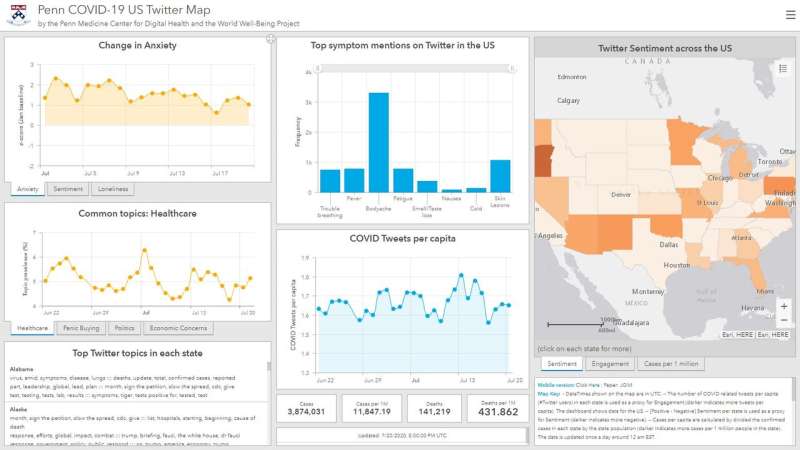
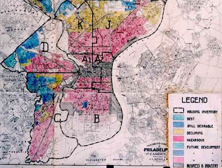
Back at the Mapping and GIS library, Misgna's team worked with computer scientist Lyle Ungar on the COVID-19 Twitter map, which provides health care workers with a region's mental state. Now, Misgna is collaborating with Carmen Guerra to see if there is a relationship between COVID-19 infections and the history of redlining.
When COVID-19's disparate impacts on African American and Latinx populations were first reported, Guerra wanted to understand why there were not only more fatalities but also higher case numbers in general. "I learned about how the social determinants of health were contributing: The type of employment, having to brave public transport, but the one that caught my eye was housing," explains Guerra. "While we understand socioeconomic status and its impact on health, we don't understand redlining and the legacy it left behind."
The project is still in the early phases, but Guerra's hope is that these maps can help inform public policies, such as having "COVID hotels" for people exposed to COVID-19 who live in shared housing to isolate if they test positive or providing free PPE on public transport. "If we can identify some of the reasons why people have greater exposure, there will be things that we can have a policy influence or medical intervention ready for," says Guerra.
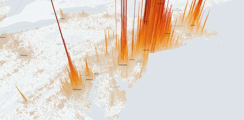
Combining coronavirus data with other demographic datasets is lecturer Mahir Yavuz, whose company Topos is making COVID-19 data accessible and interpretable with the COVID compiler. "We wanted to bring transparency, a tool that is easy to understand," says Yavuz. "Most people see this as a daily dashboard, where they can check numbers in their area or where their family lives." Interactive maps display COVID-19 cases alongside demographic data, such as age, race, income, and the presence of comorbidities, and the website also publishes detailed insights, such as correlations between COVID cases and income tax data, the locations of nursing homes, meat processing plans, and prisons, and graphs of case number changes after states reopened.
More than just a polygon
Beyond their use as tools for planners, health care professionals, and everyday citizens, maps themselves are also complex entities—far more than a simple chart with dots or numbers. "Every geography is just a polygon, but it also has culture, history, and people," says Yavuz.
"Maps appear to have a scientific reality, but maps are the product of political struggles, they have a history, and they serve certain functions," says Stewart Varner, managing director of the Price Lab for Digital Humanities, a center that supports innovative uses of technology for history, art, and culture. "The humanities are particularly good at being thoughtful about those kinds of things, because it isn't just about how the map functions, it's also what histories you want to represent."
Amy Hillier, a social work scholar who teaches introductory level GIS for social scientists and urban studies students, also emphasizes the importance of critical geography, with key questions that need to be asked, including how the existing narrative was constructed and who created the data. She says that while many students are interested in using and making maps, it's important for them to understand all of the history that goes into one. "GIS privileges the visual, it pulls you in, but it can be deceptive because there can be a lot of complexity. The idea of what argument can you make with your map—that comes out of critical geography," says Hillier.
As an urban historian, Brent Cebul says that maps, while especially useful at providing a broader perspective of historical events that traditional archival research might not capture, are still socially constructed and biased. "Maps have a way of making human phenomenon seem too rationalized and, in that way, making it easy to forget the human element that comes into play," he says. "In my teaching, I try to lend a bit of humility to what we think of as, 'This will get me from point A to point B, this is simply the way the world is'—that's really a proposition to be interrogated rather that presumed."
Charting a path forward
Perhaps because of their inherent complexity, maps could also be uniquely positioned to shed light on other issues that are equally complicated, such as the ongoing struggles in the United States to both combat the spread of COVID-19 alongside renewed calls to action against structural racism and inequality. "Maps will put it in your face," says Hillier. "I feel like now we have a window where people are willing to accept that there are inequalities. I don't think it's just because of COVID or just because of maps, but I do think people are willing to see systems in new ways."
"There's always an ability to see inequities, but there hasn't been this level interest in equity. I think that veil has been removed by the George Floyd video," says Guerra. By combining data visualizations, such as the COVID-19 and redlining project, with the many personal stories that are being shared and amplified at this time, she hopes to both quantify and address these inequities while also sharing them in a way that people can connect strongly with. "Human beings are motivated by and receptive to stories—I can show them a lot of data, but to actually hear the stories with that is very powerful," adds Guerra.
Cebul says that while maps aren't enough on their own to gain a deep understanding of a situation, they are often a good starting point because of their accessibility to new audiences—something he's seen firsthand while working as a postdoc on the "Mapping Inequality" project. "Maps do contain the power to change politics and outcomes, but it's part of a longer process of consciousness raising and teaching," he says.
Both Cebul and Varner emphasize the importance of qualitative understanding, looking beyond numbers and statistics to gain insights into an event or phenomenon. Varner adds that while many of the modern mapmaking tools used in the Price Lab were initially designed with the natural sciences in mind, he hopes that scientists in the future will take this time and this opportunity to incorporate learnings from scholars in other fields. "Just as the humanities can learn a lot from the sciences, science has a lot to learn from the humanities about ways of being thoughtful about data creation and data organization," says Varner.
Additional progress that could be supported with the help of maps, whether it's "reverse redlining" or reparations programs, is possible, says Culhane, but still requires a cultural shift. As the faculty co-director of the Center for Actionable Intelligence for Social Policy, Culhane says that while there has been progress in using maps and geospatial analyses for decision-making, there are still legal and organizational challenges that need to be addressed. "Creating that ethos is the most important part, because there's so many fears about data. People need advice on how to do this securely and in an environment of mutual trust and collaboration," says Culhane. "But once you put that framework in place, governments can collaborate at a speed that was heretofore not possible."
Continued improvements in technology, increased access to large datasets, and continued open source data movements will also continue to shape the role that maps and GIS data play in the future, perhaps even allowing researchers to track the spread of COVID-19 using data in real time. "These tools have been very sophisticated and powerful, and web-based maps have allowed for wide distribution and awareness," says Misgna.
But to take full advantage of technological improvements, especially with a tightening of government budgets in the future, Steif emphasizes that it will be crucial to have skilled people that are able to turn geospatial data into actionable intelligence. "In crisis modes, like delivering PPE or WiFi, that's not a technology product, that's a process—something that requires a tremendous amount of domain expertise. My hope is that there will continue to be some buy-in to growing these human capital resources in-house," he says.
"I think the entire world became an expert of numbers and dashboards and maps during COVID, and I feel like that is there to stay," says Yavuz. "I think there will be a lot of innovation and new ways of visualizing global or local-level data on maps, and open source code and techniques holds great potential for the future of data science and GIS technologies."


