Mapping the COVID-19 risk

Public-health experts and government officials have been calling for "social distancing," asking people to stay home and avoid contact with each other as much as possible when they have to go out—all to "flatten the curve" as the COVID-19 virus is expected to peak this month or next.
That has put families in a tough spot: They still have to go out into their communities to buy food, to the pharmacy or to other places, but they also find themselves hoping they won't run into a crowd. And no one knows what areas are most likely to have people who have been exposed to the virus.
Case Western Reserve University data scientists and researchers are doing something about that.
A team led by Yanfang (Fanny) Ye, the Theodore L. and Dana J. Schroeder Associate Professor in the Department of Computer and Data Sciences and the Institute for Smart, Secure and Connected Systems (ISSACS) at the Case School of Engineering, has developed an online risk-assessment tool that gives the user updated location-specific information about the relative risk of going to any location in the United States.
"A growing number of areas are reporting 'community transmission' of the virus, which would represent a significant turn for the worse in the battle against the novel coronavirus," Ye said. "That points to an urgent need for expanded surveillance so we can better understand the spread of COVID-19 and better respond with actionable strategies."
Ye and Kenneth Loparo, the Arthur L. Parker Professor and Faculty Director of ISSACS, have been working on the online tool since March 5 and have also released a mobile app. Users can offer input in a text box. They welcome public input on the site's usability on the "About Us" section of the site.
The program, dubbed alpha-Satellite, is "designed to assist users in assessing relative risk in the context of all the information that is available from local, community and federal agencies," Loparo said.
Users jumped on the site immediately, even as it was opened as a test site in early April, Ye said. In just the first two days, for example, more than 6,100 searches were typed into the search box and more than 22,000 places were viewed (in most cases, multiple places appear when a search is made).
Alpha-Satellite: How it works
Ye said the system, driven by artificial intelligence, is designed to automatically provide community-level risk estimates to help people protect themselves while minimizing disruptions to daily life to the extent possible.
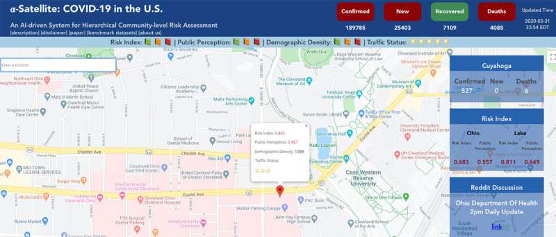
To do that, a user may either point and click at a location on a Google map or type in an address or name of a location to see risk-assessment estimates associated with the location pop-up in a text box.
Users can also type in queries, such as "grocery stores near me," and see a list and map showing the relative risk-assessment of stores nearest their location.
The primary number in the box is a "Risk Index," an automatically calculated number based on multiple factors, including the numbers of COVID-19 cases in the area and other historical demographic data, paired with dynamic, real-time information.
The user can then compare the relative risk—the higher the number, the greater the risk—of going to that precise location compared to other nearby sites, to the surrounding county, to another county or even the state of Ohio.
For example: A user clicks on three grocery stores in Lake County, east of Cleveland, and can quickly see that two have a Risk Factor of 0.760 and the third is slightly higher at 0.776. But all three are below the county average of .787—so the user can use this information to make their decision.
Then, the user sees that one store in one town might have a far lower Traffic Status of three stars, while the other is five stars, indicating higher traffic. So, now the user can choose which store to visit by combining the risk estimates with the traffic information to support that selection.
The data sources
The researchers have made the tool available for public testing—as well as the data sources and actual datasets—to rapidly get the program ready for widespread use.
Among the data used to create the tool:
- County-based COVID-19 information—including numbers of confirmed cases, new cases, deaths and fatality rate—from official public-health organizations and county government websites that is updated as numbers change online.
- Demographic data from the U.S. Census Bureau, including basic population, business and geography statistics for all states and counties, and for cities and towns with more than 5,000 people. Ye said this helps determine the risk-assessment because of factors like age distribution and population density.
- Mobility data from Google maps, estimating how congested a given area might be.
- User-generated data from social media—in this case, the site Reddit, as researchers say it focuses more on scientific discussion and policy implications of the COVID-19 pandemic.


