Global COVID-19 map viewer shows case data, age/sex features of at-risk populations

A new global map viewer shows the number of people affected by the COVID-19 pandemic down to the U.S.-county level, and provides data on age and sex groups that can help identify populations most at risk.
Developed by the NASA Socioeconomic Data and Applications Center (SEDAC) managed by CIESIN, the SEDAC Global COVID-19 Viewer: Population Estimates by Age Group and Sex lets users quickly access information without having to download and analyze large amounts of spatial population data.
A unique capability of the COVID-19 Viewer is that it lets users see age and sex features of the population for any area, by drawing circles and polygons on a map. Given evidence that the elderly and males are disproportionately at risk of hospitalization and death from the novel coronavirus, the viewer can help public health experts and local policymakers to understand the numbers of people in an area that fall into high-risk categories. Population density data are also presented in the Viewer, which is linked to transmission risks. The Viewer may be especially helpful in data-sparse developing countries.
Users can click on circles on the map to obtain the most recent numbers of COVID-19 confirmed cases, recoveries, and deaths for different administrative areas—ranging from counties in the United States to provinces/states and countries in other parts of the world.

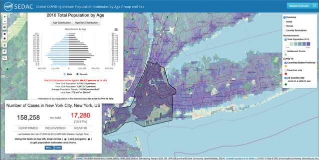
Below, the image of New York City (Figure 1) shows the results of a user clicking on a circle to get the number of COVID-19 cases and deaths there (158,258 cases and 17,280 deaths as of April 27 at 08:30:51 local time), and then drawing a polygon to display an age pyramid. The age pyramid reveals the relatively large percentage of the population in New York City in the working age groups 20–40, and the relatively low percentage (12.4 percent) of the population above age 65. The user can mouse over each of the bars in the age pyramid to identify the population in that five-year category—in this case there were approximately 75,000 men between the ages of 75–79 in New York City in 2010—or download the data as a spreadsheet for further analysis.
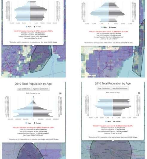
In contrast to the entire City of New York, Figure 2 (below) shows the borough of Staten Island, New York, (upper left) has a slightly older age structure (approximately 13.7 percent of its population is above age 65), and Miami Beach, Florida, (upper right) has approximately 17.3 percent above age 65, with a population heavily skewed towards the 25–60 year old demographic. Both have population densities around 3,000 persons per square kilometer. Further analysis of the data in the downloadable spreadsheet shows that in the 25–60 age group of Miami Beach there are 1.15 males for every female. By contrast with these two U.S. cities, Lagos (lower left), a developing country mega-city has a population with just 2.3 percent over age 65 but an average density of 11,000 persons per square kilometer. Finally, the aging population of Northern Italy—a region particularly hard-hit by coronavirus where age structure played an important role—is illustrated by Biella (lower right), a small city to the west of Milan, which has more than a quarter (26.5 percent) of its population above age 65. But this small city has a population density of only 1,000 persons per square kilometer.
We embarked on developing the COVID-19 Viewer when we became aware that epidemiological modelers were turning to our global spatial population data to help understand how rapidly the virus may spread. We also realized our SEDAC program has a unique set of data resources that could be relevant to the COVID-19 pandemic, for example, data on the demographic structure of the population. So we modified an existing capability, the NASA SEDAC Population Estimation Service, which lets users see age and sex features of the population, to also bring in data from Johns Hopkins University on COVID-19 cases and mortality, via a unique and simple interface.
The underlying population data are from SEDAC's Gridded Population of the World (GPW) Basic Demographic Characteristics, v4.11, for the year 2010—reflecting the most recent globally available data from the 2010 round of censuses (the 2020 round is under way now, and for many countries data will not be reported until 2023). The COVID-19 data, which are updated multiple times per day, are from Johns Hopkins University & Medicine Coronavirus Resource Center.
This story is republished courtesy of Earth Institute, Columbia University http://blogs.ei.columbia.edu.


